Oil Paint Colors: Best Choices, Mixing Tips & Palettes
Oil painting has been a favorite medium among artists for centuries due to its richness, depth, and versatility. Choosing the right oil paint colors is essential for any artist, whether beginner or professional. A well-curated palette not only makes mixing easier but also enhances color harmony in a painting.
This guide will help you understand the best oil paint colors, color mixing techniques, how to choose the right colors, and traditional oil painting palettes to improve your artwork.
A complete guide to choosing and mixing oil paint colors.
1. Understanding Oil Paint Colors
1.1 What Makes Oil Paint Colors Unique?
Oil paints differ from other mediums due to their rich pigmentation, slow drying time, and blending capabilities. Unlike acrylics, which dry quickly, oil paints allow artists to work with smooth transitions and detailed shading.
The depth and vibrancy of oil paint colors come from their high pigment concentration and the use of oil as a binder, which enhances luminosity.
1.2 Warm and Cool Oil Paint Colors
One of the key aspects of color theory in oil painting is understanding warm and cool colors:
- Warm colors: Red, orange, and yellow – create energy, brightness, and highlight focal points.
- Cool colors: Blue, green, and violet – evoke depth, calmness, and shadows.
Balancing warm and cool oil paint colors in a composition ensures visual harmony.
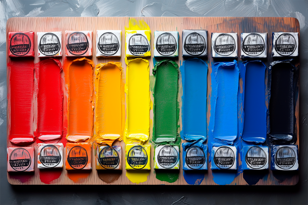
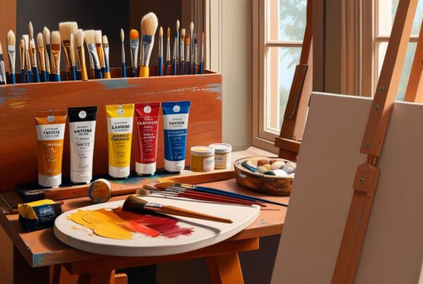
A beginner-friendly guide to essential oil paint colors in tubes.
2. Essential Oil Paint Colors for Every Palette
2.1 The Basic Oil Paint Color Palette
For beginners, having a well-balanced selection of essential oil paint colors makes color mixing easier and ensures harmony in your artwork. A strong foundational palette includes:
- Titanium White – Essential for lightening colors and creating highlights.
- Cadmium Yellow – A bright, warm yellow, perfect for mixing greens and oranges.
- Alizarin Crimson – A deep, cool red, great for creating shadows and rich purples.
- Ultramarine Blue – A strong, warm blue that works well for shadows and neutral tones.
- Yellow Ochre – A muted, earthy yellow useful for skin tones and landscapes.
- Burnt Umber – A deep brown often used for underpainting and neutralizing colors.
This basic oil paint color palette covers a wide range of applications and helps maintain color consistency in paintings.
2.2 Expanding Your Oil Paint Color Palette
Once comfortable with the basics, adding these extra colors allows for greater depth, vibrancy, and versatility in your artwork:
- Cobalt Blue – A lighter, cooler blue, useful for sky tones and atmospheric effects.
- Cadmium Orange – A bold, warm orange, great for highlights and complementary contrasts.
- Burnt Sienna – A reddish-brown essential for skin tones and earthy shadows.
- Transparent Red Oxide – A highly pigmented, transparent warm red used in glazing and rich shadows.
- Transparent Yellow Oxide – A versatile, transparent yellow perfect for layering and subtle highlights.
- Phthalo Green – A powerful, cool green that mixes well for landscapes and shadows.
These additional colors allow for a wider range of expressive possibilities, whether in landscapes, portraits, or abstract compositions.
2.3 Limited Palette for Efficient Color Mixing
Using a limited palette helps artists develop better color mixing skills while keeping color harmony simple. One of the most effective minimalist palettes includes:
- Titanium White – The key to adjusting brightness and creating highlights.
- Yellow Ochre – A muted, warm yellow that works for natural tones.
- Burnt Sienna – A reddish-brown used for depth and warm undertones.
- Ivory Black – A deep, neutral black often used for shadows and color mixing.
This limited palette forces artists to learn mixing techniques while maintaining aesthetic consistency and tonal balance in their work.
Why These Colors?
- The basic palette covers essential mixing needs.
- The expanded palette adds complexity and vibrancy.
- The limited palette simplifies decision-making and enhances mixing skills.
By understanding how to combine these colors effectively, artists can maximize their potential and create a vast range of tones without needing dozens of paint tubes.
Understanding pigment quality and lightfastness when selecting oil paints.
3. How to Choose the Best Oil Paint Colors
3.1 Factors to Consider When Selecting Colors
Choosing the best oil paint colors depends on:
- Your preferred painting style – Landscapes may require more greens and blues, while portraits benefit from earth tones.
- Mixing capability – Some colors mix more easily than others.
- Pigment permanence – Higher quality pigments last longer and maintain vibrancy.
3.2 Understanding Lightfastness in Oil Paints
Lightfastness refers to a pigment’s resistance to fading over time. The ASTM (American Society for Testing and Materials) classifies oil paints based on their durability:
- Lightfastness I – Highly permanent (100+ years).
- Lightfastness II – Moderate durability.
- Lightfastness III – Likely to fade over time.
When selecting oil paints, look for Lightfastness I ratings for longevity.
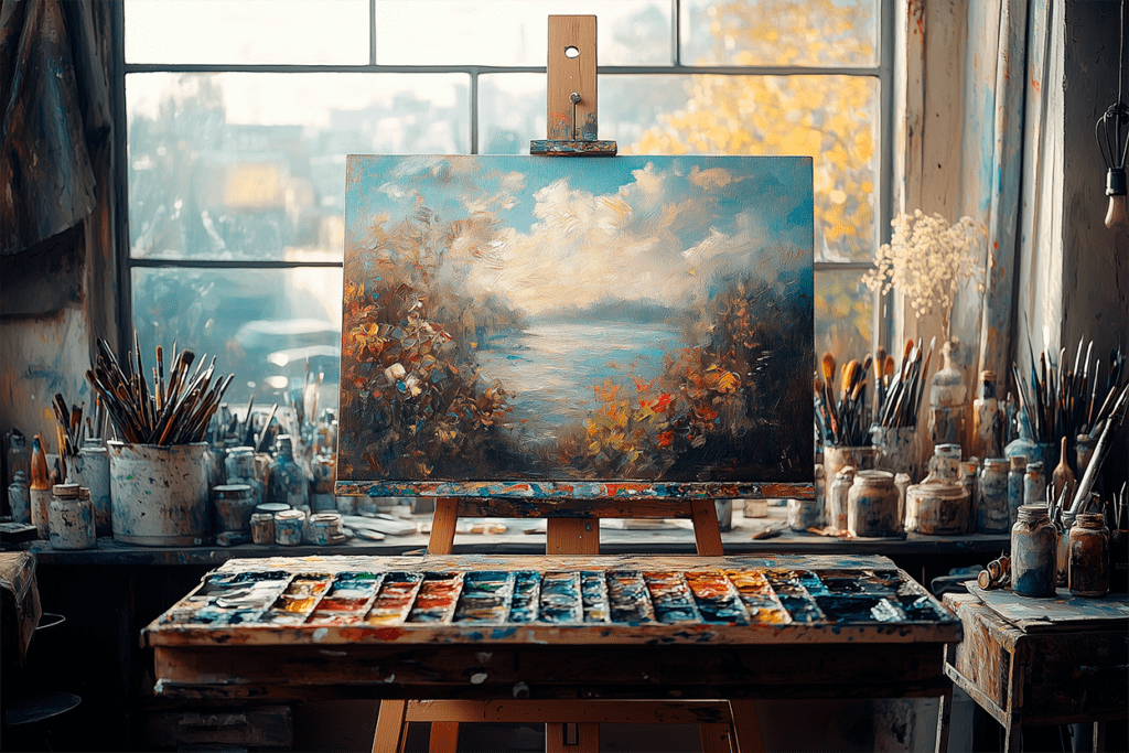
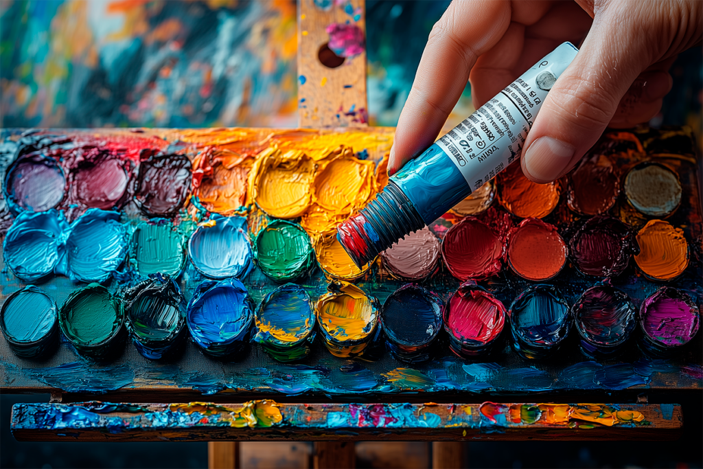
A close-up of an oil paint tube (bisnaga) being used on a classic wooden palette.
4. Mixing Oil Paint Colors Like a Pro
4.1 The Basics of Oil Paint Color Mixing
Understanding color mixing in oil painting is crucial for creating a wide range of hues. Some basic mixing rules include:
- Blue + Yellow = Green
- Red + Yellow = Orange
- Blue + Red = Purple
4.2 Using a Limited Palette for Better Mixing
A limited palette helps artists develop stronger mixing skills and maintain color harmony. One of the most famous limited palettes is the Zorn Palette, popularized by Swedish painter Anders Zorn. This palette relies on a restricted set of colors, proving that a wide range of tones can be achieved with just a few pigments.
There are two commonly used variations of the Zorn Palette:
- Original Zorn Palette – Titanium White, Yellow Ochre, Cadmium Red, Ivory Black.
- Earthy Zorn Palette (Adapted Version) – Titanium White, Yellow Ochre, Burnt Sienna, Ivory Black.
The original Zorn Palette provides warmer and more vibrant reds, while the adapted version leans toward more muted and earthy tones, making it ideal for naturalistic skin tones and subdued lighting effects.
This minimalist approach teaches effective mixing while simplifying decision-making and encouraging artists to focus on value, temperature, and composition rather than an extensive color range.
4.3 Avoiding Common Color Mixing Mistakes
- Using too many colors at once – Can create muddy results.
- Overmixing colors – Leads to dull, lifeless hues.
- Ignoring color temperature – Can make paintings feel unnatural.
By practicing controlled color mixing, artists can achieve richer, more vibrant paintings.
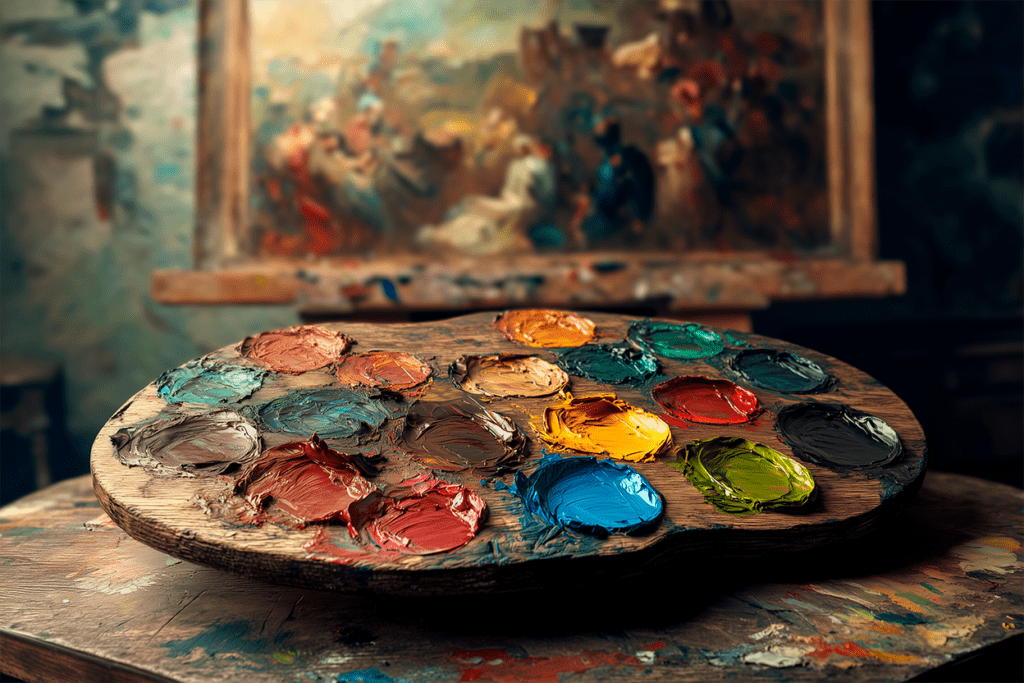
A study of oil painting color palettes used by renowned artists, from Rembrandt to Monet.
5. Traditional Oil Painting Color Palettes Used by Masters
Many famous painters used specific oil paint color palettes to achieve their signature styles. Each palette reflects a unique approach to color harmony and artistic expression.
- Rembrandt’s Palette – Featured rich earth tones and deep shadows, creating dramatic contrasts and lifelike textures.
- Monet’s Palette – Focused on bright, vibrant colors to capture light and atmosphere in Impressionist paintings.
- Da Vinci’s Palette – Included subtle natural hues and glazing techniques for soft, realistic transitions.
- Zorn Palette – A minimalist palette used by Anders Zorn, consisting of Titanium White, Yellow Ochre, Vermilion (or Cadmium Red), and Ivory Black. This limited selection demonstrates how a painter can create an impressive range of tones with only four colors, emphasizing temperature shifts and value control.
Studying these palettes helps artists understand how to use colors to create mood and atmosphere while developing their own artistic style.
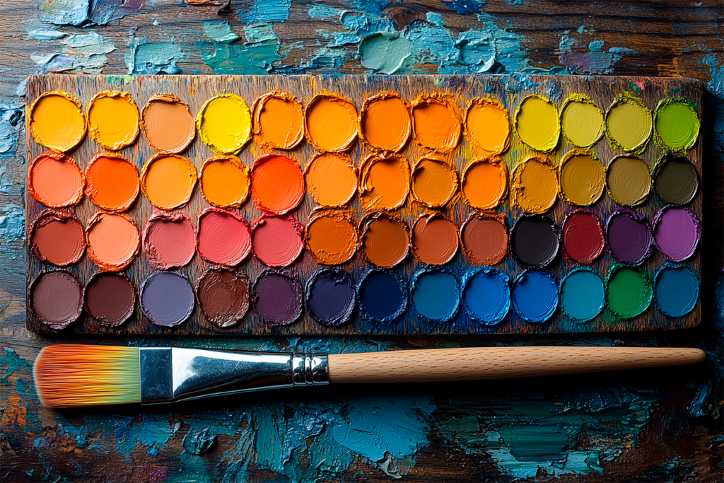
A high-quality oil paint color chart with swatches, showcasing mixing possibilities.
6. Oil Paint Color Charts and Swatches
Using an oil paint color chart can help artists visualize how pigments interact. Creating color swatches on a canvas or sketchbook allows for better mixing accuracy and quick reference.
Tips for Creating a Color Chart:
- Organize colors by hue and value.
- Test color mixing by creating gradients.
- Compare similar shades to determine best mixing choices.
Final Thoughts
Mastering oil paint colors is essential for any artist looking to improve their painting skills. By understanding color mixing, traditional palettes, and pigment selection, you can achieve rich, dynamic, and long-lasting artwork.
Now that you have a solid foundation, start experimenting with your own palette and elevate your oil painting skills! 🎨
📌 FAQ – Oil Paint Colors
What are the best oil paint colors for beginners?
Beginners should start with a basic palette: Titanium White, Cadmium Yellow, Alizarin Crimson, Ultramarine Blue, Yellow Ochre, and Burnt Umber.
How do I know if an oil paint color is high quality?
Look for Lightfastness I ratings, high pigment concentration, and minimal fillers in professional-grade oil paints.
What is the difference between warm and cool oil paint colors?
Warm colors (red, yellow, orange) create energy and contrast, while cool colors (blue, green, violet) add depth and calmness.
Can I mix my own oil paint colors instead of buying more tubes?
Yes! Using a limited palette and proper mixing techniques can create almost any shade needed.