Zorn Palette: Mastering a Limited Palette in Oil Painting
The Zorn Palette is a well-known limited palette named after Swedish painter Anders Zorn (1860–1920). Despite using only four colors, this palette allows artists to create a wide range of tones, making it a popular choice for portrait painting and traditional oil painting techniques.
In this guide, we will explore the history, composition, benefits, and practical applications of the Zorn Palette, as well as mixing techniques and how to effectively use it in oil painting.

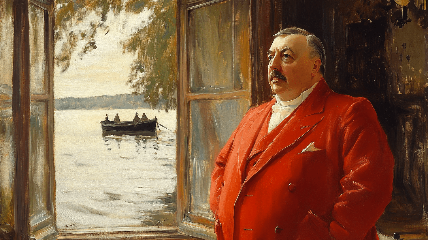
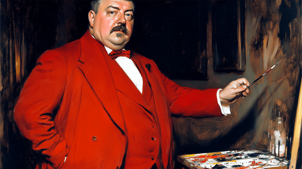
Zorn’s striking self-portrait in red, highlighting his masterful technique and bold use of color.
1. What Is the Zorn Palette?
The Zorn Palette is a restricted color palette consisting of four essential colors:
- Titanium White – Used for highlights and adjusting values.
- Yellow Ochre – A warm earthy yellow for natural tones.
- Cadmium Red (or Vermilion in traditional versions) – A vibrant warm red essential for skin tones.
- Ivory Black – A cool black that acts as a substitute for blue.
This minimalist approach helps artists focus on values, temperature, and color relationships rather than an extensive color range.

Zorn’s masterpiece depicting a lively Swedish midsummer festival, full of movement and warm summer light.
2. Why Did Anders Zorn Use a Limited Palette?
Although Zorn had access to a wide range of pigments, he frequently used this limited palette for portraits and figures. Some reasons include:
- Simplicity – Fewer colors mean easier control over color harmony.
- Naturalistic Skin Tones – The subtle color mixing creates warm, realistic flesh tones.
- Controlled Temperature – The palette naturally balances warm and cool tones.
- Improved Focus on Values – The contrast between light and dark becomes more pronounced.
Zorn’s self-portrait (1896) and many of his portraits showcase the effectiveness of this palette in capturing depth, volume, and realism.
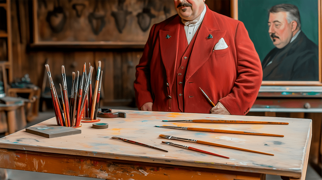
Before painting, Zorn carefully studies his limited palette, planning his color mixtures.
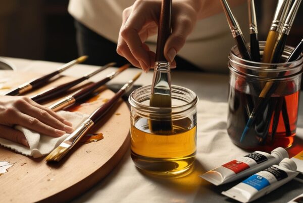
3. Color Mixing with the Zorn Palette
Even with only four colors, the Zorn Palette can produce a full range of hues.
3.1. Creating Warm and Cool Tones
- Red + Yellow Ochre = Warm Orange & Flesh Tones
- Yellow Ochre + Ivory Black = Greenish Tones (Surprising Effect!)
- Red + Black = Deep Warm Browns and Purples
- Black + White = Cool Gray & Blue-like Tones
Since Ivory Black has a slight blue undertone, it functions as a substitute for blue, making it possible to mix subtle greens and purples.
A close-up of Zorn blending rich, natural skin tones with just four essential oil colors.
4. Palette Variations
There are two main versions of the Zorn Palette:
- Traditional Zorn Palette – Titanium White, Yellow Ochre, Cadmium Red, Ivory Black.
- Earthy Zorn Palette (Adapted Version) – Titanium White, Yellow Ochre, Burnt Sienna, Ivory Black.
The traditional version creates more vibrant reds, while the earthy variation produces more muted, natural tones.
,_akvarell_av_Anders_Zorn.jpg)
A breathtaking Swedish summer scene by Anders Zorn, sold for a record-breaking 26 million SEK in 2010.
5. Advantages of Using the Zorn Palette
The Zorn Palette remains a favorite among oil painters due to its many advantages. One of its greatest benefits is the simplification of color choices, as using fewer pigments reduces decision fatigue and ensures that paintings maintain a visually cohesive look. Additionally, the palette naturally enhances color harmony because all colors derive from the same four pigments, creating a unified and balanced composition.
Another key advantage is the faster learning curve for beginners, as working with a limited palette encourages a stronger understanding of value, temperature, and color mixing without overwhelming the artist with excessive color options. This also makes the Zorn Palette a cost-effective choice, allowing artists to invest in a few high-quality paints instead of purchasing an extensive range of colors.
Most importantly, this palette is highly effective for mastering skin tones in portrait painting. The subtle balance between warm and cool hues allows for the creation of realistic flesh tones, making it a preferred choice among portrait artists.
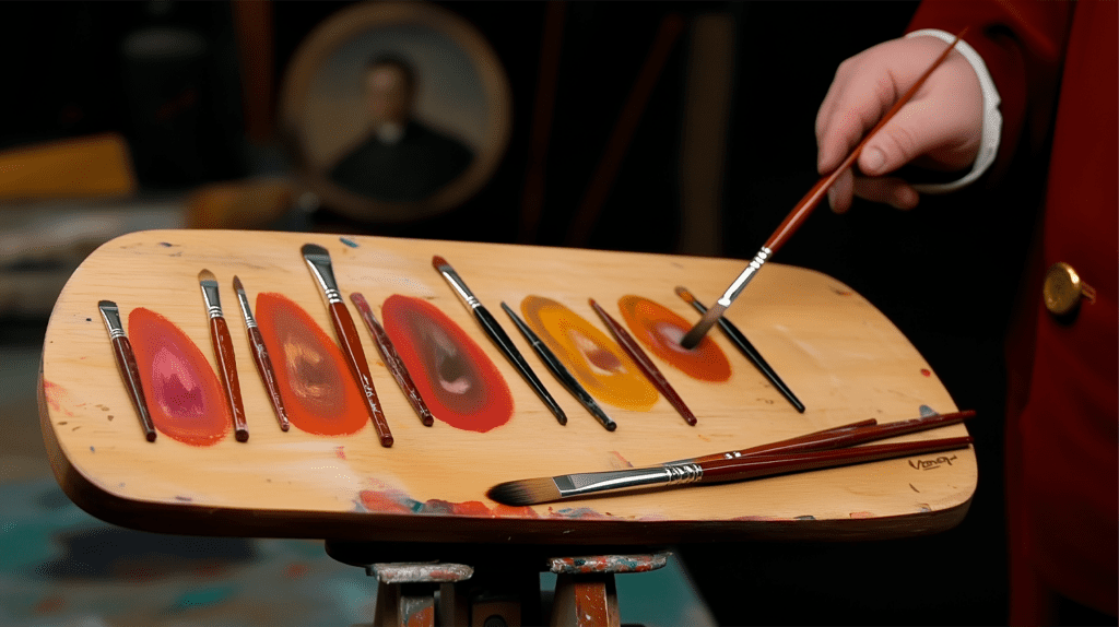
Zorn carefully evaluates his mixed colors, ensuring perfect tones before applying paint to canvas.
6. Challenges and Limitations
While the Zorn Palette is highly effective, it has some limitations:
- No True Blue – It’s difficult to achieve vibrant blues or purples.
- Limited Green Range – Although Ivory Black and Yellow Ochre create muted greens, they lack brightness.
- Less Versatile for Landscapes – The absence of strong blues and greens makes it challenging for natural scenery.
Artists working with landscapes or high-saturation paintings may need to expand the palette.
.jpg)
A masterful portrait of U.S. President William Howard Taft, painted with Zorn’s signature fluid brushwork.
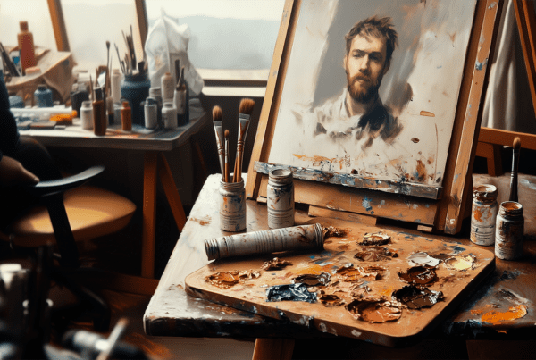
7. How to Use the Zorn Palette for Oil Portraits
When applying the Zorn Palette to portrait painting, setting up the palette efficiently is crucial. Arranging colors from light to dark helps maintain control over value adjustments, while placing Titanium White at the center makes it easier to mix highlights.
The process begins with blocking in basic skin tones, where a mix of Yellow Ochre and Cadmium Red serves as the foundation. This base can then be adjusted using Titanium White for highlights and Ivory Black for shadows, adding depth and contrast to the face. To further refine skin tones for different complexions, adding more red enhances warmth, while mixing Ivory Black and Yellow Ochre creates cooler undertones, ensuring tonal variety.
Finally, refining details is essential to bring the portrait to life. Artists can layer glazes to add depth and realism, while carefully blending edges ensures smooth transitions and prevents harsh separations between colors. By following these techniques, artists can fully harness the power of the Zorn Palette, achieving expressive, natural, and visually striking oil portraits.
8. Expanding for More Versatility
While the Zorn Palette is powerful on its own, artists sometimes expand it for more flexibility. Some useful additions include:
- Ultramarine Blue – Expands the range of blues and purples, adding depth and vibrancy.
- Alizarin Crimson – Enhances reds, deepens purples, and provides richer shadows.
- Phthalo Green – Offers intense, cool greens, ideal for landscapes and atmospheric effects.
These additions help painters adapt the palette while maintaining its core harmonic principles.
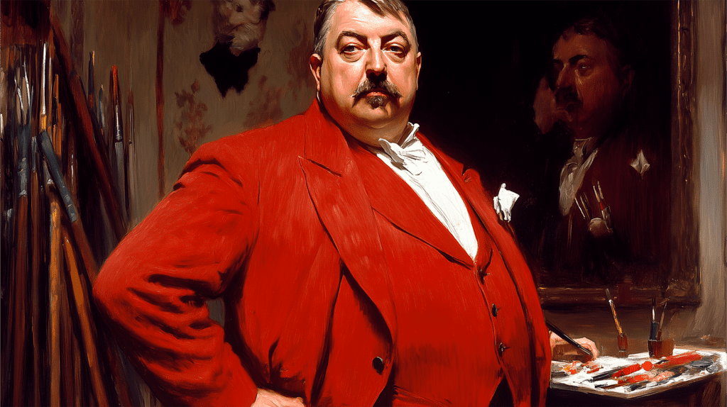
Zorn applies his expert brushwork in his studio, relying on just four essential colors.
Final Thoughts on the Zorn Palette
The Zorn Palette is an essential tool for any oil painter looking to improve color mixing, value control, and portrait techniques. Its simplicity makes it ideal for beginners, while experienced artists appreciate its harmonic effects and efficiency.
By mastering the Zorn Palette, you’ll develop a deeper understanding of oil painting fundamentals and improve your ability to capture realistic light, form, and depth.
🎨 Now it’s your turn! Try painting with the Zorn Palette and discover its power for yourself.
📌 FAQ – Zorn Palette
What is the Zorn Palette?
The Zorn Palette is a limited oil painting palette consisting of Titanium White, Yellow Ochre, Cadmium Red, and Ivory Black.
Why did Anders Zorn use this palette?
Zorn used a limited palette to create harmony, simplify color mixing, and focus on values rather than an extensive color range.
Can the Zorn Palette be used for landscapes?
It’s best suited for portraits and figure painting, but muted greens and grays can work in some landscape applications.
How do you mix cool and warm tones with the Zorn Palette?
- Warm tones – Mix Cadmium Red + Yellow Ochre.
- Cool tones – Mix Ivory Black + Yellow Ochre.
How can I expand the Zorn Palette for more color variety?
Adding Ultramarine Blue, Alizarin Crimson, or Phthalo Green allows for stronger blues, purples, and greens.